Mobile SEO: The ultimate guide
The hidden cost of mobile SEO failures
Your desktop site ranks perfectly for core commercial terms, but your organic traffic is steadily declining. The culprit is not a core algorithm update, but an overlooked mobile SEO failure. A hidden navigation tab on your smartphone layout prevents Googlebot from crawling your most critical product specifications.
Optimizing for handheld devices requires matching desktop and mobile DOMs for mobile-first indexing parity, eliminating rendering delays, and passing Core Web Vitals. Reversing traffic drops requires identifying exactly where your technical architecture blocks the smartphone crawler.
As a lead technical specialist, watching global search behavior shift while stakeholders ignore the data creates intense friction. Leadership often dismisses smartphone optimization because desktop interfaces historically convert at higher rates. They fixate on bottom-of-funnel desktop metrics while ignoring the sheer volume of top-of-funnel discovery happening on handheld devices. This blind spot reduces your acquisition pipeline.
Web behavior differs significantly across devices. Mobile devices account for 62% of global website traffic — Statista's 2025 data. Secondary reporting indicates 58% of all searches in Google are now done from a mobile device (Hitwise, DataReportal). Presenting this disparity to management is mandatory when fighting for engineering resources to fix technical debt.
Google evaluates the smartphone rendering of your pages exclusively. If a canonical link points to a desktop URL but the smartphone payload drops the primary content, the site loses the ranking entirely. The indexer completely ignores the desktop experience.
Reversing this decline requires moving beyond generic responsive templates and leveraging the best seo tools for surface-level audits. This guide provides a concrete diagnostic framework. You will learn to audit technical architecture, resolve indexing parity edge cases, and debug smartphone rendering delays systematically.
Technical architecture and rendering flaws
Fragmented mobile architectures actively degrade crawl efficiency. Maintaining separate URLs for smartphone users creates a persistent canonicalization nightmare. The server must manage bi-directional annotations linking the desktop URL to the separate mobile URL, requiring flawless execution across every single page. Responsive design is the preferred configuration for mobile websites, per Google's official documentation. A unified responsive approach consolidates link equity and halves the required crawl budget instantly.
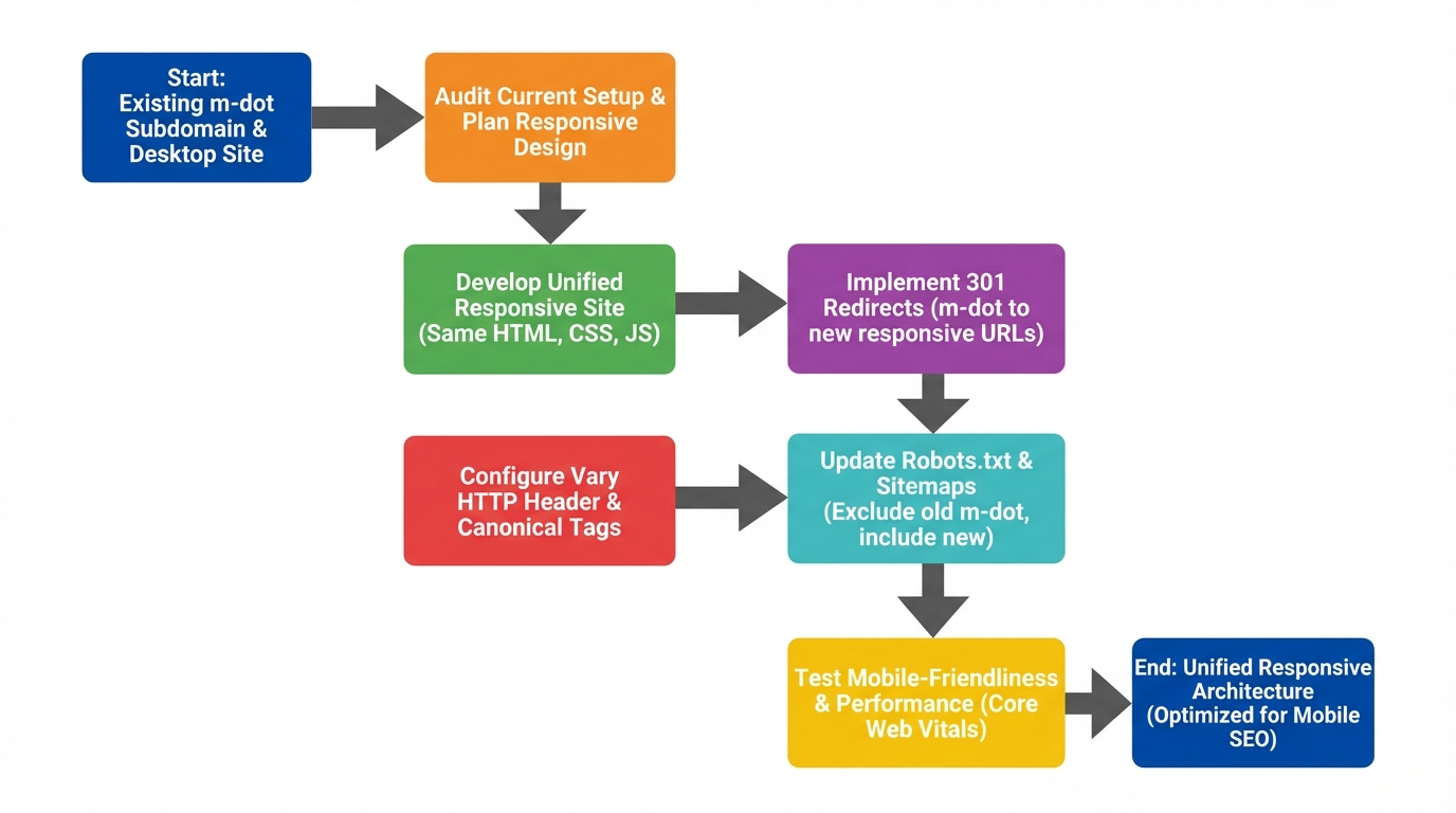
Legacy 'm-dot' subdomains introduce significant historical technical debt. Picture auditing a decade-old enterprise site operating on a fragmented setup. The separate architecture relies on a complex matrix of tags that frequently break during database updates. Sunsetting this setup requires a rigid, mathematical migration plan to protect existing organic visibility.
Removing a legacy m-dot architecture begins with log file analysis. You must find all website pages to map every separate smartphone URL to its exact responsive equivalent. Deploy permanent 301 redirects at the edge layer rather than relying on application-level routing. Remove all bi-directional alternate annotations from the desktop source code immediately. Monitor server logs to verify Googlebot Smartphone transitions without dropping its historical crawl frequency.
Rendering mechanics dictate how quickly a search engine understands your payload. The smartphone crawler operates with strict computational budgets compared to desktop agents. Client-side rendering places the entire processing burden on the requesting device or bot. If your core text relies entirely on JavaScript executing in the client's browser, the initial HTML payload arrives completely empty.
This two-pass indexing reality creates weeks of delay for large enterprise domains. The crawler must fetch the blank HTML, queue the URL for rendering, execute the JavaScript payload, and eventually index the visible DOM. High-frequency publishing sites cannot survive this latency. Server-side rendering solves this by executing the scripts on your infrastructure and delivering fully formed HTML directly to the requesting agent.
You can bypass the crawler's secondary queue entirely by implementing server-side rendering or dynamic rendering. The bot receives the exact same DOM instantly upon the initial HTTP request. This accelerates content discovery and ensures newly published articles enter the index within minutes rather than days. Engineering teams often push back due to server costs, making your crawl log analysis the primary financial justification.
Performance load patterns differ drastically based on the chosen technical framework. Standard responsive setups often carry the entire CSS and JavaScript payload needed for all desktop breakpoints. This bloats the transfer size for users on 3G or 4G connections. The browser must download code for mega-menus and sidebar widgets that are never actually displayed on a narrow screen.
Isolated, highly optimized frameworks present an alternative load pattern for publishers. Accelerated Mobile Pages load about 4x faster than their non-AMP counterparts — an established industry benchmark. They achieve this velocity by stripping the payload to bare minimums and enforcing strict asynchronous script loading. The framework requires maintaining a secondary code base with restricted component libraries.
Choosing between a streamlined responsive build and an isolated framework requires analyzing your specific content lifecycle. News publishers often accept the technical overhead of specialized frameworks to dominate top stories carousels. Ecommerce platforms generally avoid them to maintain complex interactive product filtering capabilities. The optimal path relies on enforcing strict performance budgets within a unified responsive environment.
Implementing these performance budgets requires strict developer governance. Configure your continuous integration pipeline to fail deployment if the smartphone JavaScript bundle exceeds a specific threshold, such as 150KB compressed. This automated check prevents feature bloat from slowly degrading your baseline rendering speed over time. You must integrate these checks directly into GitHub Actions or your preferred deployment environment to catch regressions before they reach production.
Consider edge-side caching configurations that serve pre-rendered HTML payloads specifically to mobile user agents. By caching the executed DOM at the CDN level, you bypass the origin server's rendering queue entirely for returning visitors. This architecture setup consistently delivers sub-200ms Time to First Byte (TTFB) metrics on standard 4G connections. Resolving these deep structural flaws creates a predictable indexation baseline, eliminating the wait for a secondary rendering queue.
Mobile configuration methods comparison
| Configuration method | Implementation approach | Maintenance overhead | SEO implications |
|---|---|---|---|
| Responsive Web Design | Single URL and identical HTML payload; layout adjusts via CSS media queries. | Low. Teams manage a single, unified codebase. | Highly recommended. Prevents mobile-first indexing parity issues by default. |
| Dynamic Serving | Single URL; server detects user agent and delivers device-specific HTML. | High. Requires complex server-side detection and strict Vary HTTP header configurations. | Acceptable, but introduces significant risk of incorrect caching and indexing errors. |
| Separate URLs (m-dot) | Distinct URLs (e.g., m.site.com) serving isolated mobile HTML content. | Very High. Demands dual codebases, strict rel=canonical, and rel=alternate mapping. | Not recommended for modern builds. High risk of losing keyword signals in mobile-first indexing. |
| Isolated Frameworks (AMP) | Secondary URLs serving restricted HTML components and strict asynchronous scripts. | High. Requires maintaining a secondary, strictly regulated component library. | Situational. Primarily viable for publishers requiring strict, lightweight frameworks to ensure fast loading, though general adoption has steadily declined. |
Mobile-first indexing parity edge cases
Through Google Search Console, you discover the indexer is actively skipping crucial product content. The desktop URL shows perfect coverage in the URL Inspection tool. The cached smartphone HTML is entirely missing the primary product descriptions and specification tables. The engineering team hid these elements using CSS display: none in the smartphone payload to save screen space, removing your primary keyword signals.
Because the algorithm relies solely on mobile-first indexing, the smartphone crawler's view of your page is the sole source of truth for the algorithm. The desktop rendering is effectively ignored for content evaluation, link discovery, and structured data extraction. If an element does not exist in the smartphone DOM, it does not exist to the search engine.
Hiding critical text behind CSS logic or JavaScript event listeners removes ranking signals immediately. Developers frequently place comprehensive buyer's guides inside expandable accordions to clean up narrow viewports. If that accordion relies on an AJAX request to fetch content only when tapped, the crawler never sees it. Content must be present in the raw HTML payload, even if it is visually hidden until user interaction.
Link architecture frequently breaks when transitioning from desktop headers to off-canvas navigations. The desktop DOM might contain 150 critical category links in a static header menu. The smartphone equivalent often requires an API call to populate those links upon a hamburger icon tap. Crawlers do not tap icons, meaning those 150 internal links vanish from the crawl path.
Inconsistent internal linking prevents PageRank distribution. Deeply nested product pages rely on category-level internal links for authority signals. When you strip these links from the smartphone DOM to simplify the user interface, those deep URLs become orphaned. Rankings decay slowly as the search engine recalculates the site's topical authority based entirely on the reduced link architecture.
Auditing desktop-to-mobile DOM parity requires a systematic developer tools workflow. Open the target page in Chrome and launch Developer Tools. Toggle the Device Toolbar to simulate a standard smartphone viewport. Reload the page to capture the exact payload served to smaller screens.
Extracting the exact HTML is your next necessary step. Right-click the <html> node in the Elements panel and copy the outer HTML. Perform the exact same extraction process with the Device Toolbar disabled to capture the desktop DOM. Paste both outputs into a text comparison tool to highlight exact line-by-line differences.
Look specifically for dropped structured data blocks during this text comparison. Many platforms inject JSON-LD schema via desktop-specific html seo tags and widget areas. When the layout shifts for smaller screens, the schema block disappears entirely. This strips your eligibility for rich snippets and advanced search features.
Automating this parity check at scale requires specialized crawling software. Configure your crawler to run two simultaneous extractions: one using a desktop user-agent and one using a smartphone user-agent. Compare the word counts, internal outlink counts, and schema validation statuses across both crawls. Any URL showing a variance greater than 10% requires immediate manual inspection.
Prioritize fixing missing internal links and missing H-tags first. Restoring dropped text blocks is typically a CSS fix, requiring developers to switch display: none to a visually hidden class that remains in the DOM. Matching the DOM across both device viewports protects organic traffic against technical decay.
Image optimization parity is another frequent failure point during mobile migrations. Developers often swap high-resolution desktop hero images for compressed mobile equivalents using the HTML picture element. If the mobile source file lacks the descriptive alt text present on the desktop version, your image search visibility drops to zero. Google processes the alt attribute exclusively from the loaded smartphone DOM. You must mandate that content teams apply equivalent metadata to all responsive image variations within the CMS.
Aggressive lazy loading on mobile devices can unintentionally hide primary content images from the crawler. If your scripts require a user to scroll before injecting the image source attribute, the bot processes an empty placeholder. Configure your intersection observers to load images slightly before they enter the viewport. Using native browser-level loading attributes ensures search engines recognize the media assets without manual scroll events. These subtle parity gaps frequently explain localized traffic drops that standard text-based SEO audits miss entirely.
Core Web Vitals & INP debugging workflows
The ecommerce director alerts you that mobile conversion rates dropped by 15% immediately following a site redesign. Google's Think With Google research found that a one-second delay in mobile load time can drop conversions by up to 20%. The issue stems from complex JavaScript logic executing on the product page. When a user taps the checkout button, the browser is locked, causing a severe delay in visual feedback.
Users assume the button is broken, tap repeatedly, and eventually abandon the session entirely. This invisible friction is measured by Interaction to Next Paint (INP). INP calculates the latency of all click, tap, and keyboard interactions throughout the entire page lifecycle. On smartphones with constrained CPUs, heavy script execution creates massive main thread failures and direct revenue loss.
What tools are best for monitoring mobile SEO performance? You need a combination of aggregated field data, active lab debugging, and the best free seo tools. You can pull baseline field data via the Search Console Core Web Vitals report. You can access historical real-world metrics through the Chrome User Experience Report. Use Chrome DevTools to actively profile main thread activity and isolate specific script bottlenecks.
Isolating INP spikes requires a granular Chrome DevTools workflow. Open the Performance panel and enable CPU throttling to a 4x or 6x slowdown. This accurately simulates the processing power of a mid-tier smartphone. Click the record button and perform the failing interaction, such as tapping a dropdown menu or adding an item to the cart.
Stop the recording and examine the resulting flame chart. Locate the Interactions track specifically. This track visually highlights the duration of the input delay, the processing time, and the presentation delay. Identify the specific yellow block representing JavaScript execution that exceeds 50 milliseconds, known as a long task.
Use the bottom-up tab to isolate the exact script URL and function name monopolizing the CPU during that long task. Often, third-party trackers, personalization engines, and client-side A/B testing scripts compete for the main thread simultaneously. The browser cannot paint the visual update for the user's tap until all these scripts finish executing.
Deferring non-critical JavaScript payloads is the primary method for resolving these thread blocks. Implement defer or async attributes on all script tags that do not affect the initial visual render. Move heavy third-party tracking pixels to a Web Worker using specialized libraries to free up the main thread entirely. This prevents analytical scripts from interfering with core user interactions.
Breaking up long tasks is necessary for scripts that must remain on the main thread. Developers can use setTimeout or the scheduler.yield() API to pause execution briefly. This allows the browser to paint pending visual updates between script chunks. The user sees an immediate response to their tap, passing the INP assessment while the script finishes in the background.
Connecting these micro-delays directly to revenue loss builds a bulletproof business case for engineering resources. Calculate the specific conversion rate drop on affected URLs since the INP metric degraded. Multiply that percentage by the average daily top-of-funnel traffic volume and the average order value. Present this lost revenue figure to leadership.
Frame the engineering sprint as a critical revenue recovery project. When developers see the direct revenue impact of optimizing a JavaScript function, technical debt prioritization shifts. Monitor the field data in Search Console closely for 28 days following the deployment to verify the fix.
Beyond long tasks, you must also audit your third-party tag manager configurations to stabilize interaction metrics. Marketing teams frequently deploy heavy tracking scripts and chat widgets directly via tag managers without consulting engineering. These scripts monopolize the mobile main thread on page load and continuously poll the DOM for user interactions. Establish a strict governance policy requiring all non-essential third-party tags to load asynchronously. This policy ensures marketing tools do not degrade the core user experience.
Use the requestIdleCallback API to defer analytical scripts until the browser has idle processing time. This configuration ensures user-initiated interactions, like adding a product to the cart, take priority over background data collection. Tracking these improvements in your analytics platform will demonstrate a direct correlation between reduced main thread blocking and increased mobile conversion rates. Documenting this correlation ensures sustained executive support for ongoing performance optimization. Linking engineering sprints directly to recovered revenue transforms technical SEO from a compliance checklist into a profit center.
Advanced feature optimization: Local, voice, and schema
Competitors leveraging Answer engine optimization are dominating new AI search summaries while your properties remain entirely invisible. The root cause often lies within the smartphone HTML payload. Missing structured data specifically on the mobile DOM locks pages out of emerging AI overviews. Data from AirOps shows pages with Article, HowTo, or FAQ schema are nearly 80% more likely to be cited by large language model tools.
If JSON-LD is stripped from the smartphone view to reduce transfer size, the page loses its eligibility for these emerging citations. The algorithm relies heavily on explicit semantic markup to parse relationships and extract factual answers quickly. Auditing your schema implementation across both device viewports ensures your content remains eligible for LLM extraction.
The physical context of a smartphone user drastically alters their search intent compared to a desktop user. A desktop user is typically researching future actions, while a smartphone user is navigating or preparing to purchase immediately. This immediate navigational intent makes precise smartphone optimization mandatory for local discoverability.
A brick-and-mortar retail client demands more immediate foot traffic. Their localized strategy relies entirely on standard desktop landing pages scaled down, completely missing the behavioral reality of on-the-go users. Think with Google reports 76% of local smartphone searches lead to a business visit within a day. Voice-based queries also constitute a major portion of local searches, demanding a completely different content structure.
Formatting your content to directly answer conversational queries captures this voice search traffic. Replace generic subheadings with natural language questions that users actually speak into their devices. Follow these headings with concise, factual paragraphs that an AI assistant can easily read aloud. This Q&A format aligns perfectly with both voice search algorithms and LLM citation mechanics.
Mapping local intent to smartphone user experience requires specific, functional formatting. Embed native click-to-call links directly on primary buttons so users can dial the store with a single tap. Integrate interactive maps directly above the fold rather than burying them on a separate contact page. These functional features satisfy the immediate navigational intent of local searchers.
Frequently asked questions
What is mobile SEO?
Why is mobile SEO important for website traffic?
How can I test if my site is mobile-friendly?
Next steps for mobile SEO optimization
Ignoring mobile-first indexing parity and rendering delays carries an immediate financial penalty. Main thread blocking and dropped internal links reduce your visibility in SERPs, decreasing your share of top-of-funnel traffic. Search engines evaluate the exact smartphone payload your server delivers, making technical architecture flaws impossible to hide.
Your specific first action is executing a comprehensive mobile-to-desktop DOM comparison crawl across your most valuable page templates. Extract the raw HTML from both viewports and identify exact missing text blocks, dropped structured data, and orphaned internal links. This diagnostic step proves exactly where the smartphone crawler is losing context.
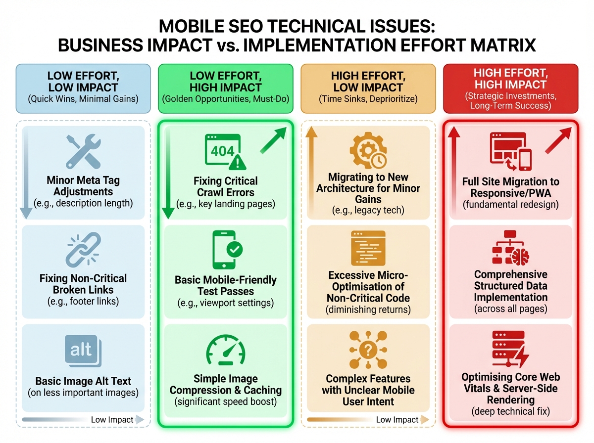
Outline a clear priority matrix for packaging these technical findings into a developer handoff document. Map issues by business impact versus implementation effort. Critical DOM parity gaps and severe INP failures blocking checkout flows require immediate engineering intervention. Frame these technical requirements entirely around recovered visibility and measurable user acquisition to secure immediate execution.
Ready to Optimize Your Mobile Technical Architecture
Stop losing top-of-funnel traffic to invisible rendering delays and mobile-first indexing gaps. Run a comprehensive DOM parity crawl and pinpoint exact JavaScript functions blocking your conversion paths. Secure the technical data you need to justify engineering resources and recover lost organic revenue.