The Complete Guide to Mobile SEO: 12 Tips & Best Practices
What is mobile SEO and mobile-first indexing?
While 62% of global website traffic comes from mobile devices (Statista, 2026), capturing that audience demands a dedicated mobile SEO strategy that moves beyond basic responsive layouts. Sitting down to review monthly analytics often reveals a widening gap between desktop and mobile organic traffic. Closing this gap requires aligning your responsive design, page speed, and content structure with Google's mobile-first indexing, mobile keyword search intent, and emerging AI Overviews.
Google now predominantly uses the smartphone version of your content to evaluate and rank your site. If your desktop site features extensive text but your mobile framework hides it behind accordions for spatial reasons, Google evaluates only the hidden version. Diagnosing visibility drops requires analyzing the exact HTML loaded on smaller screens versus desktop monitors. A technical audit must verify absolute content parity across all breakpoints, ensuring critical internal links and structured data exist regardless of the device.
Search engines penalize sites that force users to pinch and zoom or wait for massive image files to load over cellular networks. Bridging the analytics gap involves using Google Search Console to isolate mobile usability errors and indexing discrepancies. When smartphone metrics lag behind desktop performance, it usually points to rendering blockages or JavaScript timeouts rather than algorithmic penalties.
Inspecting the crawl logs often reveals unoptimized scripts preventing search engines from seeing your core text during the initial HTML pass. You must ensure that every critical piece of information renders immediately without requiring user interaction. This guide provides an actionable blueprint covering 7 strategic areas of mobile optimization. This process covers technical configuration, Core Web Vitals, advanced topic clustering, and AI search integration.
The business impact of mobile optimization
Working with a brick-and-mortar retail brand that wants to increase offline store visits requires a hyper-local approach to digital visibility. You need to optimize local landing pages to capture on-the-go smartphone users searching for nearby solutions. The high conversion potential and immediate offline impact of hyper-local queries make this optimization a primary revenue driver. In retail, 90% of consumers use smartphones for product research while shopping in a store at least some of the time. A successful local optimization campaign directly translates digital map views into physical foot traffic and point-of-sale transactions.
Local intent translates rapidly to commercial action when the user interface supports fast decision-making. Smartphone users rely heavily on immediate geographic proximity and frictionless contact methods when making purchasing decisions. 76% of local searches on smartphones result in a visit to a business within a day (Google, 2026). Capturing this intent requires landing pages that load instantly and feature prominent geographic signals with direct click-to-call functionality.
General search volume reinforces this commercial priority across all industries, not just brick-and-mortar retail. Per Hitwise's benchmark data, 58% of all queries in Google are now executed from a mobile device. More than 60% of web traffic comes from mobile, meaning missing out on this majority share reduces top-of-funnel lead volume and limits e-commerce conversions. Business-to-business companies often ignore this metric, falsely assuming procurement officers only research software on office computers during business hours.
Smartphone visibility directly controls your revenue ceiling in a highly competitive digital market. When a potential customer struggles to navigate a service page on their phone, they bounce to a competitor before ever evaluating your offer. Securing top positions for mobile queries and identifying missing opportunities with a keyword gap finder ensures you intercept high-intent buyers exactly when they are ready to transact. Prioritizing this specific channel protects your bottom line against shifting consumer hardware preferences and shrinking desktop usage.
Optimizing for mobile also shortens the overall sales cycle by capturing users during micro-moments of immediate need. A user searching for troubleshooting advice on their phone is highly likely to convert into a paying customer if your site provides the fastest, clearest solution. Sites with unoptimized mobile experiences lose these low-funnel prospects to faster competitors.
Technical configuration methods for mobile
Sitting in a technical roadmap meeting where developers suggest building a separate m-dot mobile site requires an immediate strategic pivot. You need to build a strong, evidence-based business case for modern responsive architecture instead of a fragmented domain structure. Steering the development team toward the correct, future-proof architectural decision prevents years of technical debt. Maintaining multiple codebases fractures your link equity and multiplies engineering overhead exponentially.
You can configure a website for smartphone users via separate URLs, dynamic serving, or responsive design. Legacy methods like separate URLs force you to maintain entirely different HTML on a dedicated subdomain, while dynamic serving delivers different code based on the requesting user agent. Both of these legacy methods require complex setups involving bidirectional annotations to ensure search engines understand the relationship between the desktop and smartphone versions.
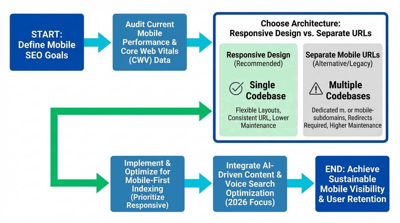
By serving identical HTML on a single URL, responsive design eliminates canonical tag errors and relies entirely on CSS media queries to alter the layout dynamically. Google's official documentation identifies responsive design as the preferred site configuration — a mandate that simplifies crawling and indexing. This method eliminates the need for complex canonical tags and ensures complete content parity across all screen sizes.
Building the business case for a responsive rebuild relies heavily on maintenance efficiency and crawl budget optimization. A single codebase means new features, security patches, and content updates deploy simultaneously across all platforms. Googlebot only needs to crawl your pages once to understand the content, saving server resources when crawlers find all website pages during indexing. Plaid's website demonstrates this approach. Their responsive design maintains site speed and intuitive navigation across devices without sacrificing brand aesthetics.
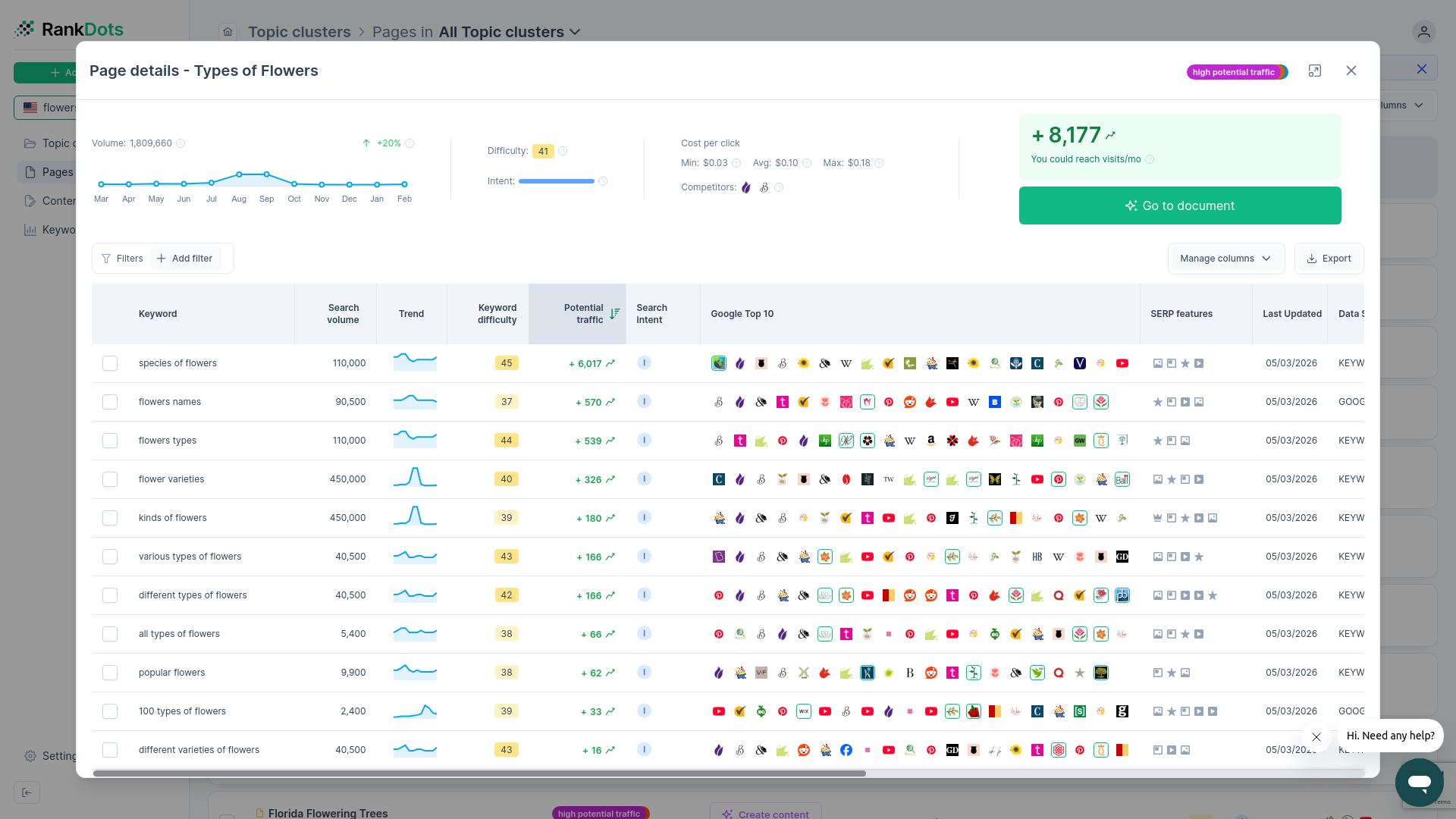
Implementation requires specific rendering instructions within your site's header code to function correctly. The HTML SEO tags and meta viewport instructions tell the browser exactly how to adjust the page's dimensions and scaling to fit the device width. Without a properly configured viewport tag, smartphone browsers will render the page at desktop width and scale it down aggressively. This forces users to pinch and zoom to read the text, creating a frustrating experience that drives up bounce rates and damages behavioral ranking signals.
Dynamic serving introduces significant risk when paired with modern caching solutions and content delivery networks. If a caching layer fails to differentiate between user agents accurately, it might serve the desktop HTML to a mobile user. Fixing these caching misconfigurations requires constant developer intervention and extensive quality assurance testing across hundreds of different device types. Responsive design completely bypasses this risk by trusting the client's browser to handle the presentation layer locally. The technical foundation you choose dictates the complexity of your daily marketing operations.
Configuration Matrix
| Configuration Type | Setup Complexity | Maintenance Cost | SEO Risk |
|---|---|---|---|
| Responsive Web Design | Low (Relies on client-side CSS media queries) | Low (Requires maintaining only a single HTML codebase) | Low (Google's preferred approach; avoids caching mismatches) |
| Dynamic Serving | High (Requires accurate server-side user-agent detection) | High (Demands constant QA across emerging device types) | Medium (Susceptible to serving incorrect desktop HTML via CDN caches) |
| Separate URLs (m-dot) | Medium (Requires redirection logic and subdomain setup) | High (Requires updating and testing two completely distinct sites) | High (Prone to canonicalization errors and split link equity) |
Mobile page speed and Core Web Vitals
When the marketing director highlights a massive drop-off in the mobile checkout funnel, the root cause is rarely the product offering. The site is likely bloated, leading to high load times that reduce conversions and increase immediate bounces. A poorly optimized interface lowers the ROI of your SEO efforts, regardless of how well your content targets specific keywords. Speed dictates revenue directly on smaller screens, where users have significantly less patience for rendering delays.
Slow load times directly decrease revenue. A single-second delay in mobile load time can reduce conversions by up to 20% — Google's performance data. Google's dataset indicates that if your site takes over five seconds to load, 90% of smartphone users may leave immediately. Diagnosing these delays requires analyzing the specific metrics that measure user perception of speed rather than just total download time.
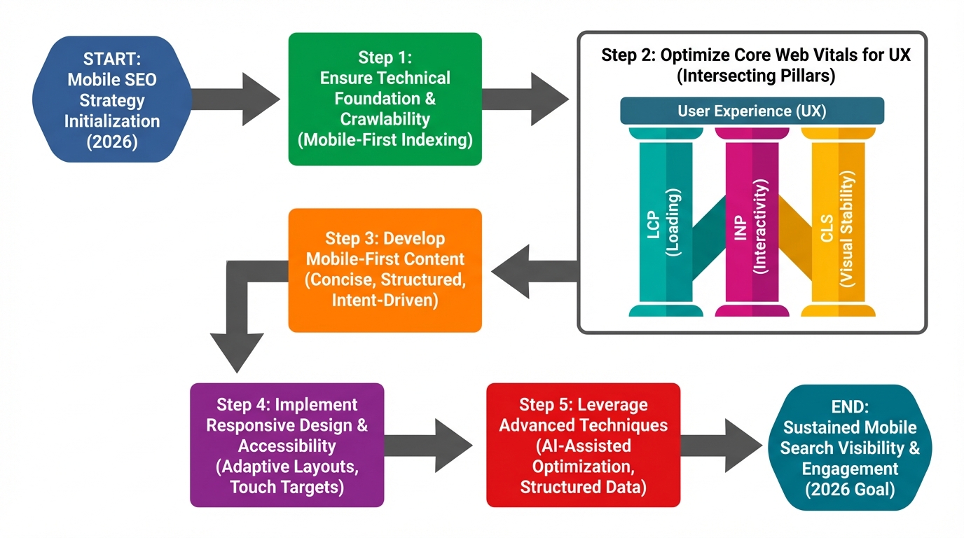
Core Web Vitals heavily influence organic rankings by quantifying the user experience. You lose conversions when Largest Contentful Paint (LCP) delays your main hero image, or when a high Interaction to Next Paint (INP) makes buttons feel unresponsive. Similarly, Cumulative Layout Shift (CLS) frustrates users by causing elements to jump unexpectedly during loading, leading to misclicks.
To improve these metrics, analyze your rendering path using Google PageSpeed Insights. First, optimize image delivery by implementing modern formats like WebP and configuring strict lazy loading for off-screen visuals. Second, minimize render-blocking resources by deferring non-critical JavaScript and inlining critical CSS directly in the document head. Ensure that custom fonts are preloaded to prevent text elements from shifting or remaining invisible during the initial page load.
Server response times also heavily influence performance scores, particularly for users on slow cellular networks. While the average speed in the U.S. has jumped to 27.06 Mbps from 11.14 Mbps in just eight years, server response times also heavily influence performance scores. Implement aggressive caching layers and use a content delivery network to reduce the physical distance between your server and the user. Every millisecond saved during the server handshake directly protects your conversion rate and improves your standing in search results. Resolving these technical bottlenecks is the prerequisite for a profitable mobile presence.
Mobile user experience and interface design best practices
Technical configuration simply gets the page to load; the interface design determines if the user stays to convert. Smartphone UX directly influences behavioral signals that search engines monitor, such as bounce rates and active session duration. A frustrating interface completely negates the value of high-quality content and careful use of keyword clustering tools. You must design specifically for thumbs and touchscreens rather than precise mouse cursors.
Touchscreen navigation requires precise spatial planning to prevent accidental clicks. According to Google's accessibility guidelines, tap targets must be at least 48 by 48 pixels, with sufficient padding between clickable elements to prevent accidental taps. When a user tries to click a product category but accidentally hits the adjacent privacy policy link, they rarely return to try again. Provide ample whitespace around primary calls to action to guarantee accurate interactions, especially on critical e-commerce category pages.
Intrusive interstitials and pop-ups actively damage organic visibility on smaller screens. Search algorithms heavily penalize pages where the primary text is obscured, and negative mobile experiences can hurt your brand. Any required banners, such as cookie consent notices or age gates, must consume minimal screen real estate. Allow easy dismissal without blocking the core information the user specifically clicked from the search engine to read.
Structuring navigation menus demands a strategic choice between traditional hamburger icons and bottom navigation bars. While hamburger menus save valuable vertical space, bottom bars place critical links directly within reach of the user's thumb. This reduces physical friction on modern, oversized smartphone screens, making it easier for users to browse your catalog one-handed. Assess your core user journeys to determine which layout minimizes the effort required to reach the checkout screen.
Readability under varying environmental conditions is another critical ranking factor often ignored by designers. Smartphone users frequently browse outdoors where direct sunlight creates intense screen glare. Ensure your body text uses a legible font size, typically 16 pixels minimum, and maintains high contrast ratios against the background. Testing your design in bright sunlight frequently reveals usability flaws that office-bound developers easily miss during the QA process.
Mobile content strategy and topic clustering
Translating a successful desktop content strategy to a smaller screen requires more than just fluid layouts. Smartphone user intent demands concise, front-loaded content structures rather than dense, academic paragraphs. Users searching on their phones typically seek immediate answers, requiring you to place the most critical information at the very top of the page. Burying the primary conclusion behind a lengthy introduction guarantees a high bounce rate and signals to search engines that your page lacks relevance.
Organizing your content using a topic cluster generator specifically for touchscreen navigation hierarchies prevents users from getting lost in deep site architectures. Build shallow hub pages that link out to highly specific subtopics, minimizing the number of taps required to reach terminal articles. A user looking for winter running shoes should not have to tap through five category layers to find a specific product review. This flat structure allows both readers and search engine crawlers to map your topical authority efficiently without exhausting their crawl budget.

Formatting plays a major role in content consumption on six-inch screens. Write headings that clearly summarize the article, allowing users to rapidly skim the page to find exactly what they need. Break long paragraphs into shorter, two-sentence blocks to prevent walls of text from overwhelming the reader. Use descriptive internal anchor text so readers understand where a link goes without needing to hover over it, which is physically impossible on a touchscreen.
Aligning keyword strategy with smartphone behavior often involves trend-based keyword research to capture the localized query intent. On-the-go searches frequently carry implicit geographic modifiers or indicate an immediate need for a physical solution. Evaluate your target keywords through the lens of a user standing in a store aisle or commuting on a train. Adjust your content tone to deliver fast, actionable advice that helps you create content that ranks and solves their immediate problem rather than providing exhaustive historical context.

Integrating non-text elements also requires strategic formatting to maintain engagement and prevent layout shifts. Data tables must be coded to scroll horizontally within their container rather than breaking the overall page width. Ensure any inserted charts or graphs remain legible without requiring the user to pinch and zoom. By structuring your content around the physical constraints of a smartphone, you align perfectly with Google's mobile-first indexing algorithms.
Internal linking within these clusters must use large, easily tappable interface elements rather than tiny inline text links. Consider using styled buttons or full-width navigation cards to connect pillar pages to cluster content. This approach reduces friction and encourages users to explore related topics, increasing overall session duration and sending positive engagement signals back to the search engine.
Tracking mobile SERP features and AI Overviews
Presenting the quarterly SEO strategy roadmap to the executive team requires justifying continued investment beyond basic foundational fixes. You need to position the brand to capture emerging channels like voice search and Answer Engine Optimization. Securing the majority share of global web traffic requires adapting to these new discovery methods proactively. Showing exactly how search behavior is shifting provides the concrete evidence needed to secure your upcoming marketing budget.
The visual layout of Google's search results has fundamentally changed on smaller screens. Because mobile screens are smaller, longer title tags are far more likely to be rewritten before showing in search results. AI Overviews and rich snippets now consume the vast majority of above-the-fold display real estate. Traditional organic blue links are frequently pushed down below full screens of generated answers and interactive carousels. Tracking absolute ranking positions is no longer indicative of actual visibility or expected click-through rates.
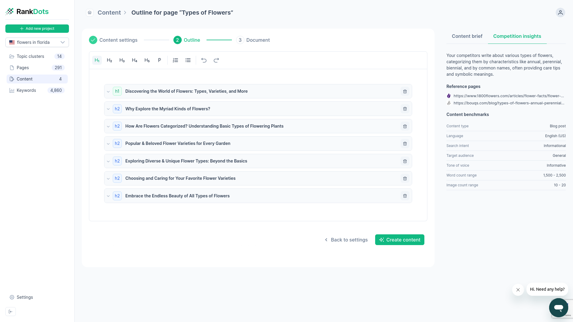
Capturing these zero-click features requires highly structured formatting within your articles. Organizing your data into clear lists, comparative tables, and concise direct answers significantly increases your eligibility for inclusion in AI-generated summaries. Search engines prefer parsing well-structured HTML elements over extracting facts from lengthy narrative paragraphs. If you want your pricing data featured in an overview, format it as a clean HTML table rather than burying the numbers inside a descriptive paragraph.
Voice search queries further alter the required approach to keyword selection and content design. Users speak to their digital assistants differently than they type, using longer, conversational phrases and distinct question formats. Adapting your long-tail keyword strategy to match this natural phrasing ensures your content aligns with how people actually ask for information. A typed query for running shoes becomes a spoken query asking exactly which shoes are best for specific foot conditions.
Integrate AI search optimization into your organic strategy. Monitoring which specific SERP features appear for your target queries using a SERP similarity tool dictates exactly how you must structure your competitive response. If every query in your primary topic cluster triggers an AI Overview, your entire content strategy must pivot to feed those generative models using an AI writer.
Structured data is required to capture these enhanced mobile features. Schema markup translates your content into a machine-readable format, directly feeding the knowledge graphs that power AI Overviews. In fact, pages with Article, HowTo, or FAQ schema are nearly 80% more likely to be cited by large language model tools (LLMs). Ensure your product pages utilize strict JSON-LD markup to highlight prices, availability, and review ratings, guaranteeing this critical information surfaces directly in the mobile search results before the user even clicks your link.
Measurement, testing, and diagnostic tools
Discovering a sudden traffic drop requires immediate, data-driven investigation rather than guessing which stylesheet broke. Checking mobile compatibility requires combining automated crawler data with real-user device emulation. Numerous platforms are available for testing and monitoring mobile SEO, including browser-based inspection panels and the best free SEO tools. With 58% of global web traffic originating from mobile devices (DataReportal, 2026), rigorous diagnostic routines protect your primary revenue pipeline.
You can use Google Search Console as the most direct feedback loop for identifying algorithmic rendering failures. Use the "Mobile Usability" report to isolate exact URLs suffering from viewport configuration errors and tap target proximity violations. You must also monitor the "Page Indexing" report to find pages that the smartphone crawler accessed but refused to index, which often points to JavaScript timeouts. Exporting these specific error logs gives you a definitive, data-backed blueprint to hand over to developers, bypassing subjective debates about interface design.
You do not need engineering resources to replicate rendering blockages locally. You can simulate smartphone environments directly using a four-step browser developer tools workflow:
- Open the Developer Tools panel and click the "Toggle Device Toolbar" icon to switch the viewport into responsive mode.
- Select a specific hardware model from the dropdown menu to match your audience's most common screen dimensions.
- Navigate to the "Network" tab and change the throttling profile to "Fast 3G" to mimic standard cellular latency.
- Check the "Disable cache" box and reload the page to observe exactly how render-blocking resources delay the initial layout.
Relying solely on manual checks leaves your site vulnerable to hidden code regressions during weekly development sprints. By running a Lighthouse audit within your browser, you generate an immediate, lab-based diagnostic report covering accessibility, performance, and best practices. You should supplement this single-page analysis with third-party enterprise crawlers configured strictly with a smartphone user agent. Configure these external diagnostic platforms to continuously scan your entire architecture, which alerts you when an engineer accidentally deploys an unoptimized image directory or a render-blocking script.
Proactive traffic protection means catching visibility drops before the marketing director reviews the monthly analytics dashboard. You must configure automated anomaly detection within your analytics platform to monitor specific device categories.
Create a custom insight alert that filters exclusively for organic search traffic on smartphone devices. Set the condition to trigger an immediate email notification if daily smartphone sessions drop by more than ten percent below the historical baseline, checking past layouts with a Wayback Machine alternative if necessary. This automated early warning system allows you to identify technical misconfigurations and roll back problematic code deployments before they cause permanent ranking decay.
Frequently asked questions
How does mobile-first indexing affect desktop rankings?
Why is mobile page speed critical for e-commerce sites?
Does responsive design perform better than a separate mobile URL?
How do local search queries differ on smartphones?
Which technical metric causes the most mobile rendering failures?
Start optimizing your mobile performance
Identify rendering blockages and Core Web Vitals issues before they reduce your conversion rates. Run a comprehensive diagnostic audit to ensure your site architecture supports fast, accessible experiences across all devices. Catch usability errors early to protect your organic visibility and bottom-line revenue.